
The Psychology of Color in Hospitality Interiors
Walk into a hotel lobby you love and notice what happens first.
You may clock the chandelier, the texture of the sofa, the subtle hum of conversation — but your nervous system has already responded to color. Before we consciously register a single design detail, our bodies are quietly deciding: Am I safe here? Do I want to stay? Do I belong?
In hospitality, color is not just aesthetic preference. It is psychological infrastructure — shaping how long guests linger, how deeply they rest, how much they spend, and whether they feel compelled to return.
This is where color stops being “what looks pretty on a moodboard” and starts operating as strategy.
How Our Brains Read Color (Before We Can Explain Why)
Color is one of the fastest signals the brain processes. In milliseconds, it:
Triggers emotional responses (calm, alertness, hunger, romance)
Activates memories and associations (heritage, culture, past travel)
Influences physical state (heart rate, tension, appetite, fatigue)
Three levers matter most in hospitality interiors:
Hue – the family of color (blue vs. red vs. green)
Saturation – how intense or muted that color feels
Value – how light or dark it is
A saturated crimson wall in a dim cocktail bar can feel seductive and intimate. The same red, blasted across a brightly lit breakfast room, can feel aggressive and exhausting.
Great hospitality design isn’t just “choosing blue” or “avoiding beige.” It’s curating the exact hue, saturation, and valuethat tells the right emotional story in each space — and making sure that story stays consistent with the brand.
Designing an Emotional Journey Through Color
Every guest moves through a sequence: arrival, transition, dwelling, unwinding, and departure. Color can choreograph that journey.
Think of your property as a narrative arc:
Arrival – first impression, brand promise, sense of place
Public spaces – social energy, appetite, discovery
Private spaces – safety, restoration, intimacy
Wellness zones – nervous system regulation
Nightlife zones – heightened mood, intrigue
Instead of treating each room as an isolated design problem, use color to create a continuum — subtle shifts that guide guests from stimulation to softness, from curiosity to rest.
Lobbies & Arrival Spaces: Confidence and Orientation
The lobby is your thesis statement. Guests decide within seconds if the story you’re telling matches the one they want to be part of.
Color cues that work well here:
Grounding neutrals (stone, sand, warm grey) to signal stability and ease
A single, confident brand accent (deep oxblood, inky navy, emerald, or ochre) to leave a strong memory trace
Controlled contrast so signage, circulation paths, and key focal points are intuitively legible
Too many competing hues at arrival can create low-level anxiety: guests feel visually “shouted at” before they’ve even checked in.
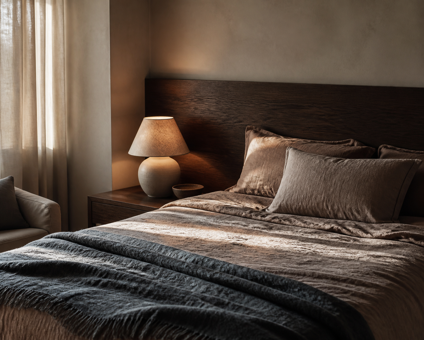
Guestrooms: Where Color Learns to Whisper
Guestrooms are where the nervous system should finally exhale.
Psychologically, this is not the space to prove how daring the palette can be. It’s the room where guests must:
Feel safe enough to sleep deeply
Reset after transit or social stimulation
See themselves in the space (not just the brand’s ego)
Color strategies that support this:
Desaturated hues – stormy blue-greys, moss, clay, mushroom, sand
Lower contrast – fewer sharp jumps between dark and light
Warm undertones in neutrals to avoid sterility
Reserve bolder color for small, intimate gestures: a velvet headboard, a piece of art, the lining of the wardrobe, the inside of a niche. This keeps the room emotionally rich without over-activating the mind.
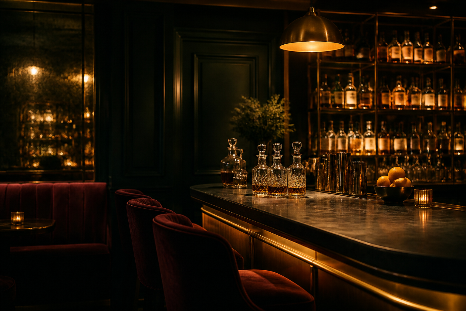
Bars, Lounges & Nightlife: Permission to Intensify
Here, guests are seeking a different state: connection, play, intrigue. Color can safely turn the volume up.
Successful palettes often lean into:
Deep, saturated tones – midnight blue, aubergine, bottle green, charcoal
Velvet blacks and dark woods that cradle the space
Metallic accents (brass, bronze) to catch the eye and signal luxury
Psychologically, darker, richer colors in low light:
Encourage guests to linger longer (and order one more round)
Soften self-consciousness — people feel less exposed
Make illuminated drinks, faces, and focal points feel jewel-like
The key is to balance drama with direction. A bar that is all dark tones with no chromatic hierarchy can feel disorienting rather than seductive. Use color to highlight circulation paths, the bar itself, and key seating zones.
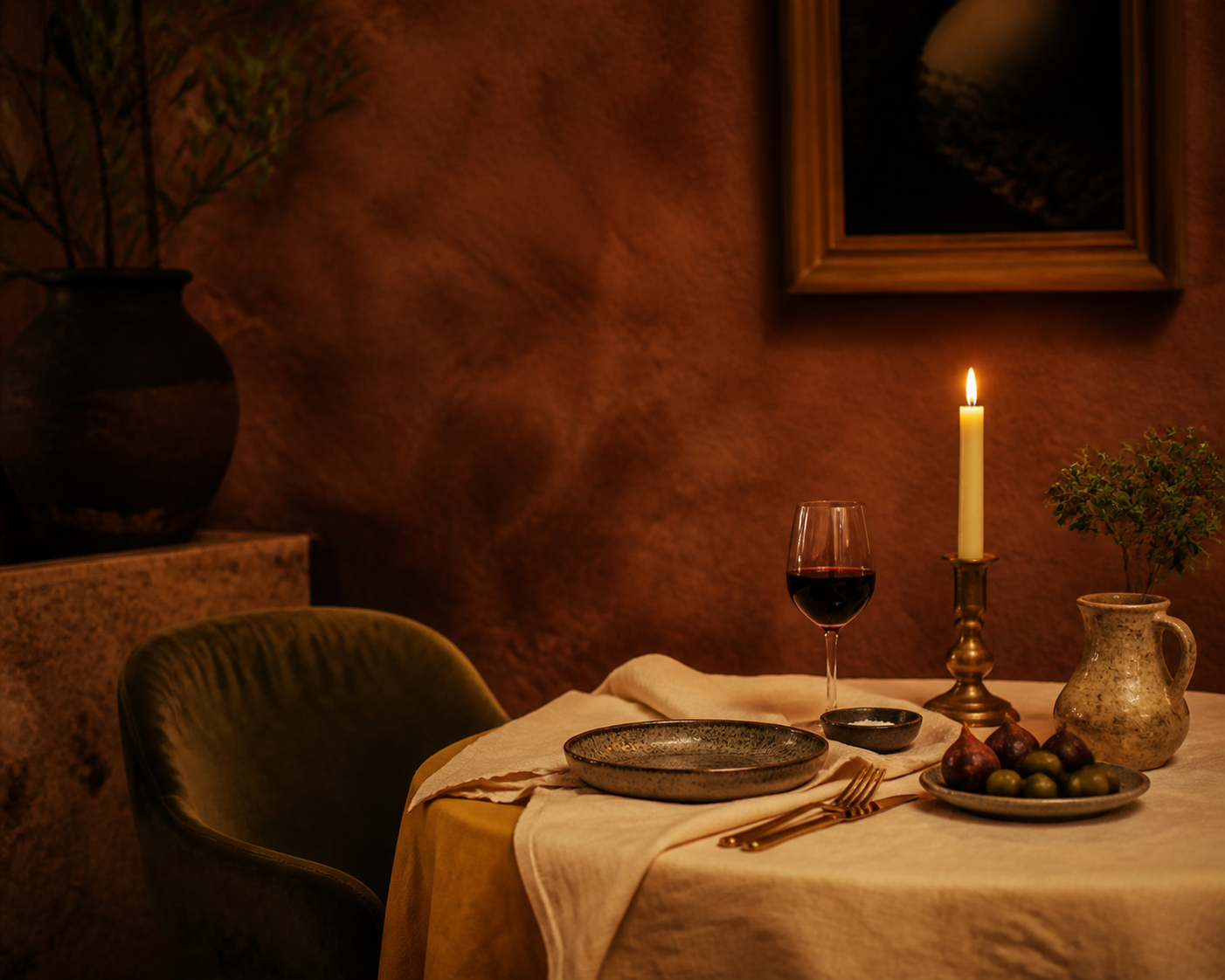
Restaurants & Cafés: Appetite, Warmth, and Pace
Color directly impacts appetite and perceived temperature.
Warm, earthy palettes (terracotta, cumin, olive, saffron, cream) tend to support appetite and sociability.
Cool, stark palettes (icy whites, harsh blues) can make food feel less inviting and spaces feel less inhabited.
Saturation and value matter here as well:
Quick-service or high-turnover spaces often use brighter, more saturated color to subtly increase energy and table turnover.
Slower, more intimate dining rooms benefit from deeper, moodier tones that invite lingering conversation.
The plate is also part of the palette: the contrast between food and tableware affects how fresh and appetizing dishes appear.
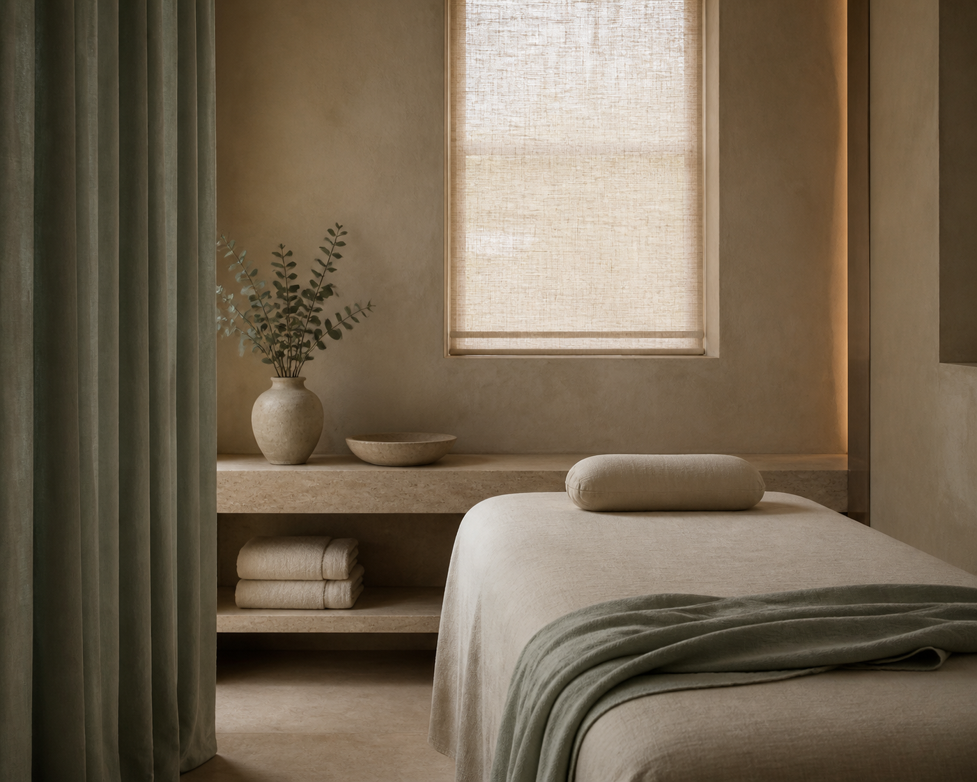
Spas & Wellness Zones: Nervous System Neutralizers
Spas, treatment rooms, and quiet zones must lower cognitive load.
Effective color moves here include:
Soft, low-contrast neutrals with undertones of green, blue, or warm stone
Limited accent color (if any) — a single muted sage, a soft blush, a gentle sea-glass tone
Integration with natural materials so color appears through texture (linen, stone, wood, clay) rather than painted intensity
Too many contrasting colors or sharp whites in wellness spaces can feel clinical instead of calming.
Culture, Context, and the Meaning Guests Bring With Them
Color psychology is never entirely universal. Guests arrive with their own cultural, regional, and personal associations.
In some cultures, white reads as purity; in others, it is closely tied to mourning.
Red can signify luck and celebration, or danger and warning.
Green may evoke eco-consciousness and renewal, or institutional spaces and currency.
For globally-minded hospitality brands, this means two things:
Do your cultural homework for primary markets and key guest segments.
Use symbolism intelligently rather than literally — a palette can nod to local culture without becoming a theme park.
The goal is to create interiors that feel contextually rooted while still emotionally coherent for a diverse guest list.
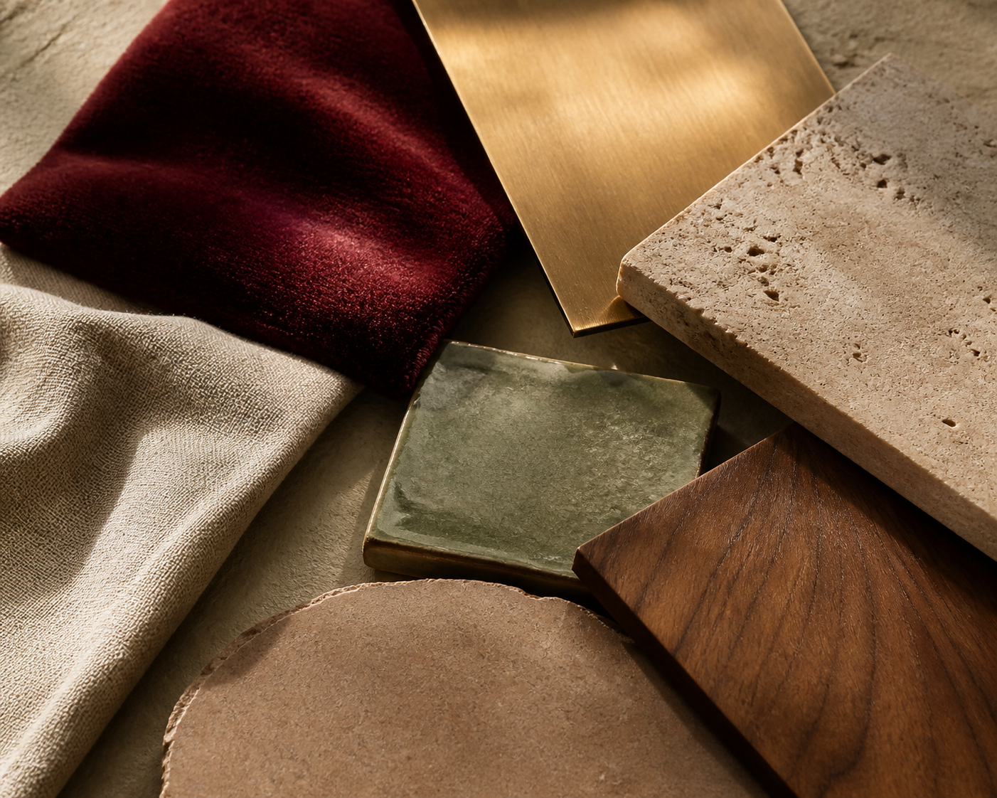
Color Beyond Paint: Materials, Light, and Details
In hospitality, color is rarely just a wall decision.
It lives in:
Materials – stone, wood, tile, metal, textiles
Lighting – color temperature, dimming strategy, reflected vs. direct light
Art and objects – books, florals, ceramics, sculptures
Uniforms and menus – the mobile color palette your staff carries through the property
A perfectly chosen wall color can be undone by overly cool lighting. A thoughtful lobby palette can be fractured by a rogue branded rug or inconsistent uniforms.
The properties that feel most seamless are the ones where color is treated as a system — expressed through every touchpoint, not just an accent wall.
A Practical Framework for Hoteliers and Designers
To move color psychology out of theory and into your next project, try this workflow:
Name the emotional arc.
What do you want guests to feel at arrival, mid-stay, and at night?
Choose one or two “hero” colors that embody the brand.
These show up in key touchpoints: lobby gestures, bar focal points, signature details.
Build a supporting cast of neutrals.
Warm and cool variants that can flex across guestrooms, corridors, and back-of-house.
Assign emotional roles by zone.
Lobby: confident, grounded.
F&B: warm, appetizing.
Rooms: restorative, soft.
Spa: quiet, neutral.
Bar: moody, magnetic.
Test palettes under real lighting conditions.
Day vs. night, artificial vs. natural light, candlelight vs. LEDs.
Edit rigorously.
If a color doesn’t serve the emotional arc or the brand story, it doesn’t belong — even if it looked beautiful on Pinterest.
Designing Feelings, Not Just Rooms
When guests say, “I don’t know what it is about this place — I just feel different here,” that is color psychology doing quiet, powerful work.
The hues you choose, the way you layer them, and the emotions they summon become part of your property’s signature. Long after the specifics of the furniture fade, people remember how a space felt.
In hospitality interiors, that feeling is not accidental. It’s designed — one thoughtful color decision at a time.